6 min readWeb DesignTypographyAccessibility
Website Typography: A Practical Guide to Readable Text
Written by Nethma DissanayakeOnline Store Builder6 min read
Fonts, sizes, spacing, hierarchy and contrast: the typography decisions that make a website easy to read, accessible and trustworthy.
Typography is the part of web design that visitors notice least and feel most. When text is easy to read, people stay longer, understand your message faster, and trust the business behind it. When text is hard to read, they leave, often without knowing why.
This guide covers the decisions that matter most: choosing fonts, setting sizes and spacing, building a clear hierarchy, and checking that text works on phones. It's written for business owners, freelancers, and developers who want their sites to look professional without becoming design experts.
Why typography matters on a website
Most visitors don't read a page from start to finish. They scan headings, skim paragraphs, and decide within seconds whether a site is worth their time. Typography controls how well that scanning works. Clear type helps visitors find what they need. Cramped or inconsistent type makes even a strong product look careless.
Good typography also supports accessibility. Readers with low vision, dyslexia, or tired eyes rely on size, contrast, and spacing. Designing for them usually makes the site better for everyone.
Choose fonts for legibility
Start with one or two typefaces. One font for headings and one for body text is enough for most sites. Using three or more fonts usually adds visual noise without adding clarity.
For body text, choose a font designed for reading on screens. Clean sans-serif fonts such as Inter, Source Sans, and Roboto are common choices. Serif fonts can work well for editorial or traditional brands. Save decorative or script fonts for short headlines or logos, where readers won't need to read long passages.
Check character support before you commit. If your audience reads or writes in Sinhala, Tamil, Arabic, Japanese, or another script, confirm that your font includes those characters. Without support, the browser substitutes another font, and the page can look uneven.
Load fonts with care. Include only the weights and styles you use. Set font-display: swap in your CSS so text appears right away while the font loads. This prevents a blank page during slow connections.
Set size and line height
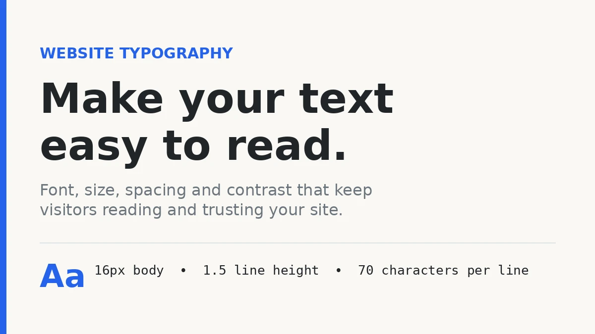
Body text should be at least 16px on desktop and mobile. Text smaller than this is tiring to read, especially on a phone held at arm's length.
Line height, the vertical space between lines, affects reading comfort. For body text, a line height of about 1.5 to 1.6 works well. Tight spacing makes lines blur together, while very loose spacing makes paragraphs feel disconnected. Headings can use tighter spacing, around 1.2 to 1.3, because they are short and large.
Line length matters too. Lines that stretch across a wide desktop screen are hard to follow, because the eye loses its place when it jumps back to the left edge. A comfortable range is about 50 to 75 characters per line. In CSS, you can limit a text container with max-width: 70ch.
Build a clear hierarchy
Readers should be able to tell what matters most without thinking about it.
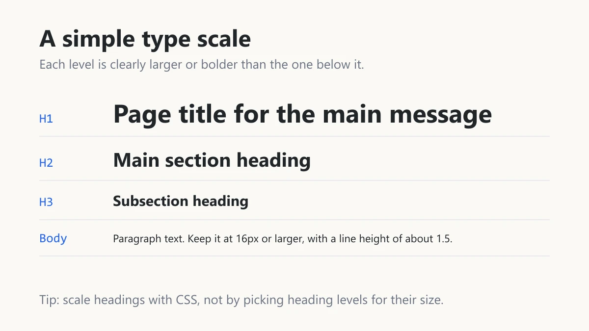
Use one H1 for the main title of each page. Use H2 for major sections and H3 for subsections. Choose heading levels based on the content's structure, not on how big you want the text to look. Control the visual size with CSS.
Make the differences between levels obvious. A common scale for desktop might be 16px for body text, 20px for H3, 28px for H2, and 40px for H1. Scale the headings down on mobile so they don't overwhelm small screens.
Use spacing and weight as well as size. Extra space above a heading signals the start of a new section. A bold lead-in phrase can introduce a paragraph without a heading.
Keep contrast high
Contrast is the difference in brightness between text and its background. Low contrast is one of the most common readability problems on modern websites, especially light gray text on white.
The Web Content Accessibility Guidelines (WCAG) recommend a contrast ratio of at least 4.5:1 for normal body text. Larger headings can use 3:1. Free contrast checkers, such as the WebAIM Contrast Checker, let you test your colors before launch.
If your site supports dark mode, test contrast in both modes. A color pair that works on a white background may fail on a dark one.
Make typography work on mobile
Most visitors use phones, so test text on real devices, not only in a desktop browser.
Use relative units such as rem or em for font sizes. These units respond to the user's browser settings, so readers who enlarge their text will see the change. Fixed pixel sizes ignore those preferences.
Keep body text at 16px on small screens. Don't shrink it to fit more content. Instead, simplify the layout, shorten paragraphs, or move secondary information elsewhere.
Give links and buttons enough space to tap comfortably. Small, crowded links cause mistakes and frustration.
Use spacing to create rhythm
Short paragraphs, typically two to four sentences, are easier to scan than long blocks of text. Add generous space between sections so each one is clearly separate.
Lists work well for steps, features, and requirements. Bold key terms sparingly, so emphasis still means something. Subheadings give readers landmarks as they scroll.
Stay consistent across pages
Use the same font, sizes, and colors for the same role on every page. If one H2 is blue and another is black, visitors will wonder whether the difference means something.
Define your type styles once, in CSS variables or design tokens, such as --font-body, --text-lg, and --color-text. When you need to change a style, you update one place instead of hunting through every page.
Consistency also helps returning visitors. A familiar layout makes a site feel reliable.
Common mistakes to avoid
- Using too many fonts or weights. Each extra style adds visual noise and slows page loading.
- Justifying body text. On the web, justified text can create uneven gaps between words. Left-aligned text is easier to read.
- Setting long passages in all caps. Capital letters are harder to read in bulk. Reserve them for short labels.
- Putting text inside images. Screen readers can't read text in images, and search engines can't index it. Keep text as real text.
- Ignoring fallback fonts. If a custom font fails to load, the page should still look clean in a standard system font.
- Relying on color alone. Links, errors, and warnings should be clear without color, for example with underlines or icons.
A quick typography checklist
- One or two readable typefaces, with support for your audience's language
- Body text at 16px or larger
- Line height of about 1.5 to 1.6 for body text
- Line length of about 50 to 75 characters
- A clear H1, H2, and H3 hierarchy
- Contrast ratio of at least 4.5:1 for body text
- Relative font units, tested on a real phone
- Type styles defined once and reused consistently
Final thoughts
Good typography rarely draws attention to itself. It just makes content easy to read, which keeps visitors engaged long enough to understand what you offer. Start with the basics: a readable font, 16px body text, comfortable line height, and clear headings. Then check your site on a phone, in both light and dark mode, and fix whatever is hard to read.
For more on accessible design, read the WCAG guidelines on text contrast. For a related guide, see my post on using Claude for writing without sounding like a robot.